Scalable design system for 30+ designers powering 80M orders a month across web, mobile, and POS
Widelab · Lead Design System Designer
Overview
Unified previously separate design systems for web, mobile, and POS into a single, token-based foundation used by 30+ designers across Otter.
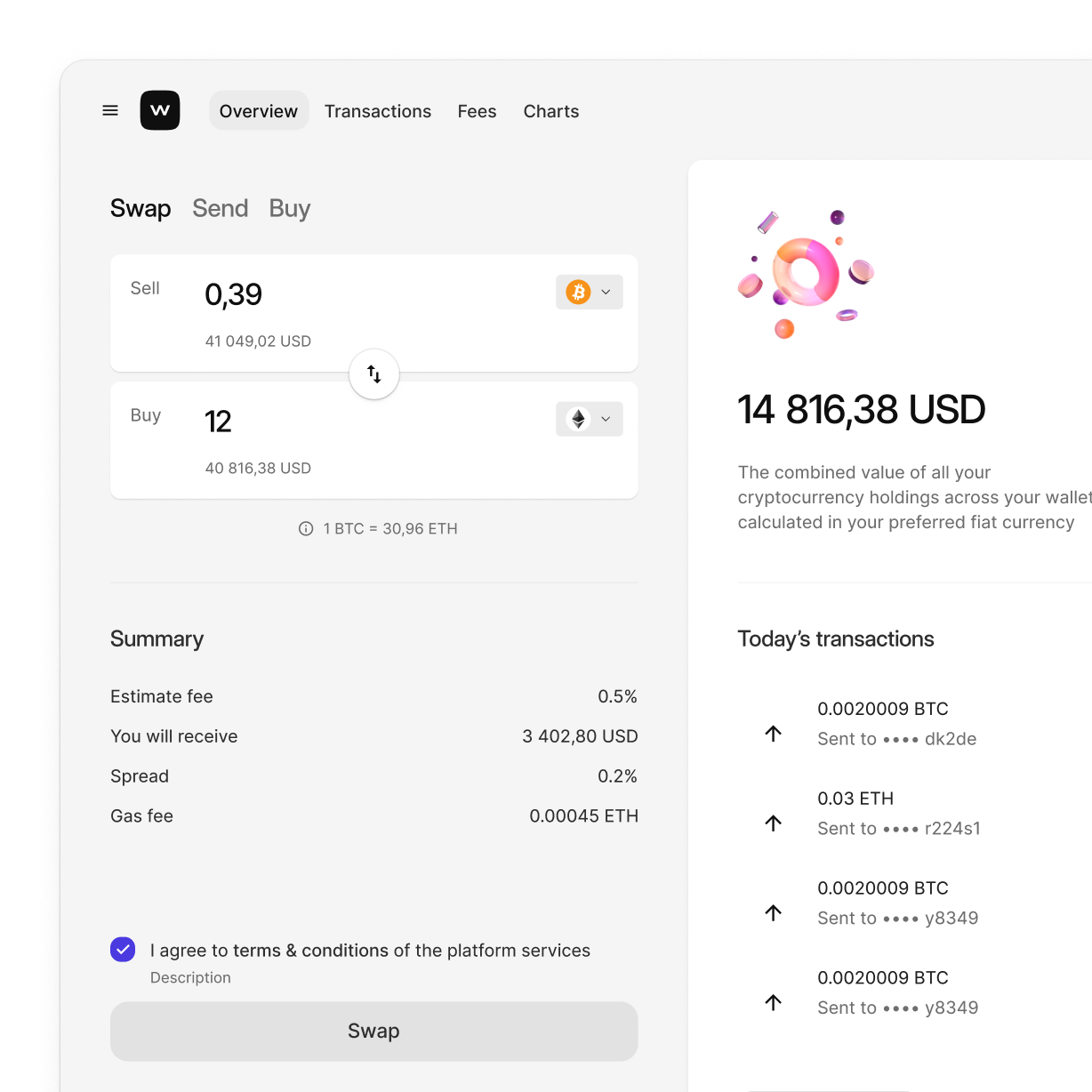
The system improved accessibility, ensured cross-platform consistency, and significantly reduced maintenance overhead. Designed to scale across a wide range of device types — from mobile to large-format POS.
Shipped iteratively without disrupting ongoing product work, enabling seamless adoption across all teams.

Challenge
CloudKitchens had two separate design systems — one for web and mobile layouts, another for native apps and POS. Despite visual similarities, each was maintained independently, leading to inconsistency, duplicated effort, and confusion across teams.
My challenge was to unify these systems into one scalable, token-based foundation that could adapt to different platforms and screen sizes. I also had to fix major accessibility issues in dark theme, support unique needs of POS devices, and ensure a smooth, non-disruptive migration path for over 30 active designers.
My role
I was the sole designer responsible for conceiving, structuring, and executing the entire design system unification at Otter.
My responsibilities spanned from defining the token architecture, building cross-platform components, and ensuring accessibility compliance, to documenting the system and supporting developer handoff.
Throughout the project, I collaborated closely with the Product Design Manager, who provided feedback and support during major milestones.
I also handled designer onboarding through internal documentation and a series of walkthrough videos that explained key decisions, usage guidelines, and implementation details.
Process
I started with a full audit of both design systems and proposed a unified structure. Then I rebuilt the token architecture from scratch, introducing viewport-based density and full dark mode support.
Using Figma variables and auto layout, I redesigned every core component, ensuring consistency across web, mobile, and POS. All work was done in branches to avoid interrupting live projects.
I worked closely with devs to implement the system in Storybook, reviewed all outputs, and signed off before rollout.
Finally, I created full documentation and walkthrough videos. Designers adopted the new system via Swap Library in just a few clicks.
Key solutions
Created a unified token structure with clear separation between primitives and semantic tokens.
Each token supported both light and dark theme, as well as density scaling across screen sizes.
Built one shared component library for web, mobile, and POS — optimized for Figma variables, auto layout, and consistent properties.
Enabled effortless migration through Swap Library with 1:1 mapping, despite a redesigned internal structure.
Delivered full documentation, component playgrounds, and a developer-ready Storybook setup.
Results
The unified design system fully replaced two previously separate libraries and became the foundation for all design work across web, mobile, and POS at Otter. It was adopted by over 30 designers, significantly improving onboarding, reducing confusion, and bringing much-needed consistency across platforms.
Collaboration with developers became more efficient, thanks to a clearer token structure and shared language. Despite the scale of changes, the rollout was smooth and non-disruptive — and the system continues to grow as part of Otter’s core design infrastructure.